
Shop
Some of my paintings and drawings are available as art prints, canvas prints, framed prints, posters and even cushions!
I am currently taking commissions. Please get in touch to discuss your needs without obligation enquiries@wendybooth.co.uk or check the prices here.
Several of my original drawings and paintings are available to buy on Art Finder.
![]()
For prices of portraits drawn from your own photographs please check my Commissions page.
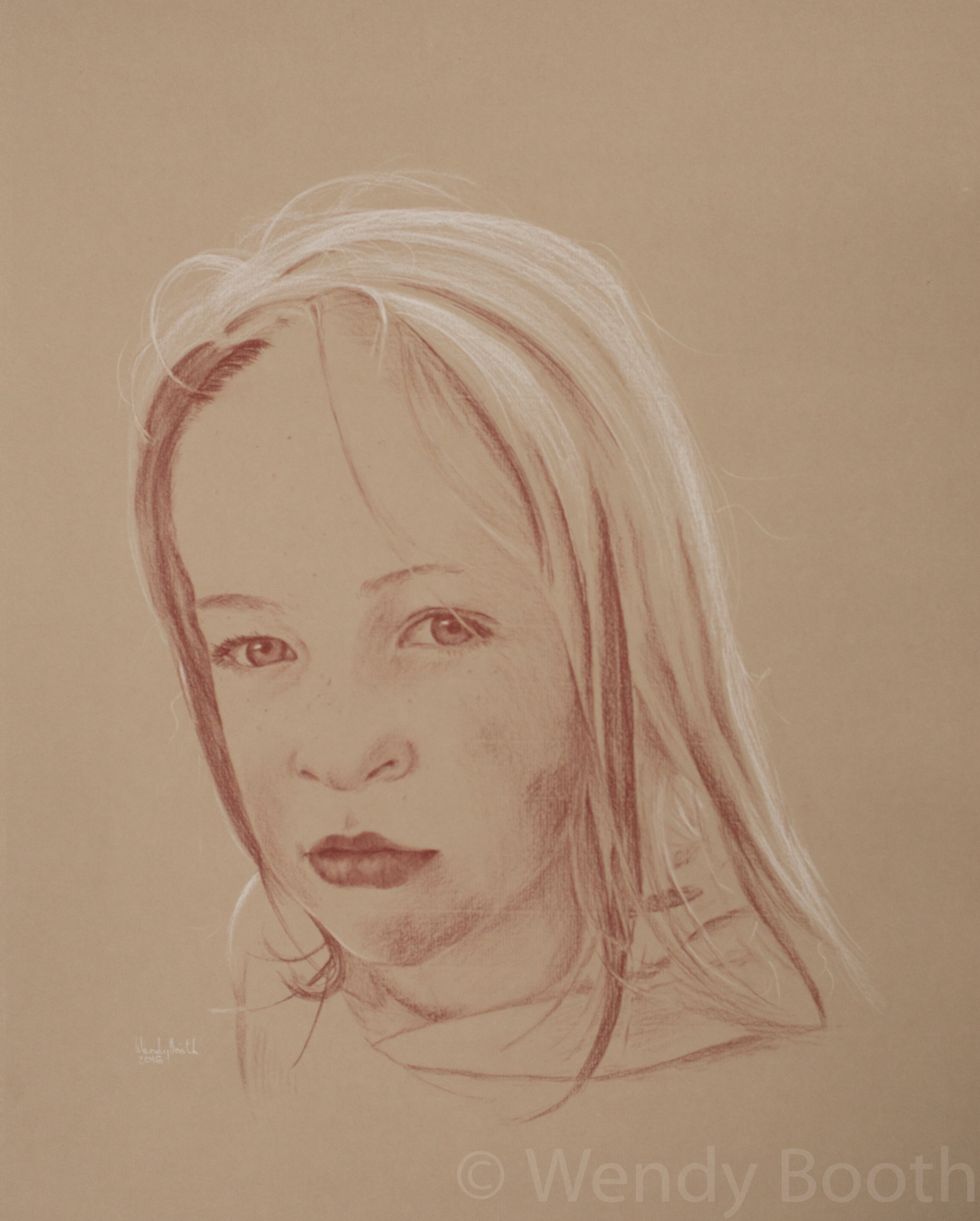
Demo: Girl from Backlit Photograph
This gorgeous young girl is my niece. She has a beautiful ready smile which lights up her face the second she spots a camera. Any camera could capture this easily, but what I want is more subtle. Here, I managed to capture the quizzical look in the split second between her spotting me and realising there was a camera (actually Samsung 6 Edge) in her face.
[block_grid type=”two-up”] [block_grid_item] The light from behind gives her a ‘halo’ of sunlit hair, but the face itself is in shadow and there is very little contrast. This is where Lightroom comes into its own. I can easily adjust the levels, contrast and exposure so that any given part of the photograph gives me what I need. Here though, parts of the hair are overexposed and no amount of playing with levels is going to give me any detail. However, I haven’t lost vital facial features – this is a small amount of hair and I believe I can make a good guess at the texture. [/block_grid_item] [block_grid_item] [image src=”http://wendybooth.co.uk/art/wp/wp-content/uploads/2016/03/black-white-photo-169×300.jpg” alt=”Backlit photograph” type=”thumbnail”] [/block_grid_item] [/block_grid]I will refer to the photograph constantly during the process so it is essential that focus is good, especially around the eyes, and that I can adjust the levels.
[block_grid type=”two-up”] [block_grid_item] [content_band bg_color=”#ffe6cc” border=”all” ] [container] [custom_headline style=”margin: 0;” type=”left” level=”h4″ looks_like=”h3″ accent=”true” class=”my-custom-headline”]Equipment
[/custom_headline]
A2 Drawing board
Strathmore Velvet Grey charcoal paper (full sheet)
A3 Tracing paper
A3 cartridge paper or sketchbook
Low tack masking tape
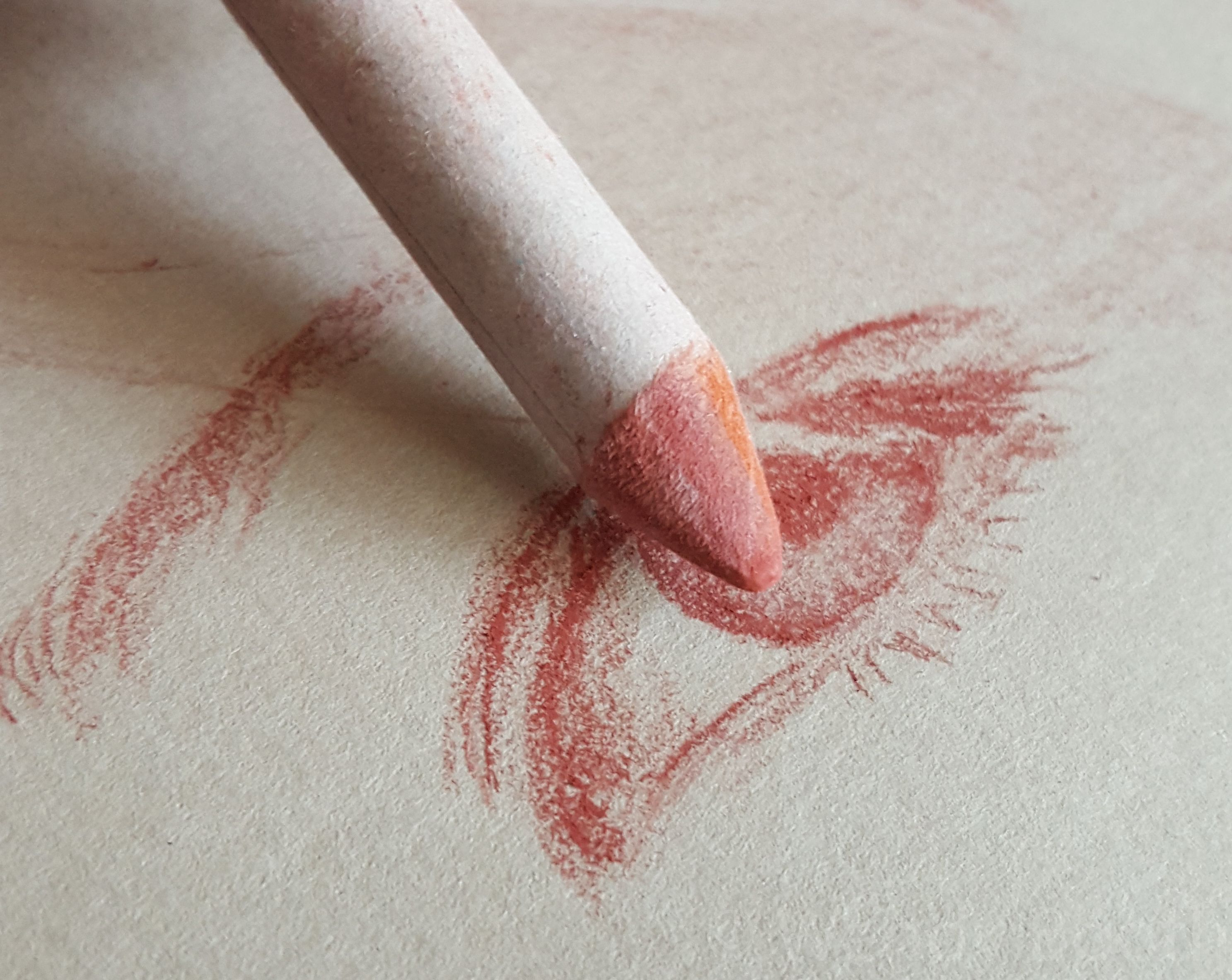
Carbothello Capuut Mortem Red pastel pencils
Carbothello Titanium White pastel pencil
Surgical knife
Sanding boards
Tissues
Torsion stump
2B Pencil or clutch pencil
Metal ruler
Table-top easel
[/container] [/content_band]
[/block_grid_item] [block_grid_item] I will cover notes about my equipment in another post – how to sharpen the pastels etc. But now let’s just jump straight in and start drawing.
My sketchbook is supported by the drawing board on a table-top easel in the most upright position. I find it essential to draw the foundations in this way. To draw with the paper flat on the table will give a distorted impression which will only become apparent when I look at the drawing head-on. However, during the whole process my board will be up on the easel and in every possible position flat on the table, turned around and back up again many many times.
I use an A2 drawing board with 3 or 4 pieces of cartridge paper permanently taped down with masking tape to give it a little bounce. The other side of my drawing board is a mess and used to support boards and canvases for oil painting – this is also where I cut the paper to size using the surgical knife and a metal ruler.
[/block_grid_item]
[/block_grid]A full sheet of Strathmore is slightly larger than the drawing board so an inch or so needs cutting from a short side and a long side. I will keep the paper with the smooth side (with the sticker) face up and this is the side I will use. Charcoal paper has less tooth than pastel paper. I am not applying thick pigment so this paper is just about right for getting those difficult smooth textures.
[block_grid type=”two-up”] [block_grid_item] 1) For the initial drawing on A3 paper, the whole head must fit the paper, but I don’t worry too much if there is a lot of hair, or clothing that doesn’t fit. Once it is transferred to the larger Strathmore paper there is room to expand.
I use a Faber Castell 2B clutch pencil – just because I love it! – but any soft pencil will do. At this stage I make a contour study (line drawing) with no reference to tone or value. It is possible to draw straight onto the charcoal paper, but I find that getting the features set first allows me much more freedom in the pastel pencil phase.
When creating a likeness there are no shortcuts. [/block_grid_item] [block_grid_item] [image src=”http://wendybooth.co.uk/art/wp/wp-content/uploads/2016/03/pencil-line-drawing.jpg” alt=”Artist line drawing portrait” type=”thumbnail”] [/block_grid_item][/block_grid]Detailed observation is crucial, but particular areas to focus on are eyes, mouth and facial shape, which if out of place will jump straight off the page. As I am making a contour study (line drawing) I don’t have clues like shading to hint at a likeness, but I’ve now come to learn that if the lines are accurate then the resemblance will come later.
2) To transfer my line study to Strathmore paper, I use good old fashioned tracing paper. Each corner is torn off so I can use a square of masking tape on each to hold it firmly while I trace the lines with a hard pencil. I then turn over the tracing paper and (leaning on the back of a sketch book) trace the marks with my pastel pencil.
At this point I will consider the composition, which I’ve largely neglected before now. I always give plenty of room above and around the head. If the subject is looking away from the viewer then there needs to be space in that direction for them to look into. Also, there should be enough room beneath the face for some shoulder and clothes – this places the person and gives a little of their story.
When I’ve decided on the position I tape the tracing paper – with minimal masking tape – and trace very lightly over the lines with a ballpoint pen. Be careful the pen’s nib is clean and doesn’t drop too much ink because if this smudges onto the paper you’ll need to start again.
[block_grid type=”three-up”] [block_grid_item] [image src=”http://wendybooth.co.uk/art/wp/wp-content/uploads/2016/04/sanguine-tracing.jpg” alt=”Tracing the back of the drawing with pastel pencil” type=”thumbnail”][/block_grid_item] [block_grid_item] [image src=”http://wendybooth.co.uk/art/wp/wp-content/uploads/2016/04/putty-dabbing.jpg” alt=”Dabbing with a putty rubber” type=”thumbnail”] [/block_grid_item] [block_grid_item] [image src=”http://wendybooth.co.uk/art/wp/wp-content/uploads/2016/04/sanguine-on-strathmore.jpg” alt=”Line drawing in pastel pencil” type=”thumbnail”] [/block_grid_item]
[/block_grid]
3) Once I think I’ve finished the trace I peel off two corners and carefully pull back the tracing paper to make sure I have everything down before removing it completely. There will often be a few places where the pastel has transferred inadvertently and I will dab these off with a putty rubber. Now I’m ready to start creating.
4) I will have thought about dark/light areas before but now it’s important to establish the three main values so I can determine where I will be using my two pastels. Ideally, around 70-80% of the flesh will be in ‘normal’ light, ie, not in shadow and not shining. If this is the case then I can use the red pastel (which I sometimes call Sanguine, but actually isn’t!) for the darks, and the white for the highlights. This is ideal but not always so. Sometimes I will have to use more white than ideal and/or more red. This isn’t a problem but takes more care because large areas of either can introduce too much texture if rushed.
[block_grid type=”two-up”] [block_grid_item]Starting in the top left corner (I’m right handed) which is usually the hair, I will begin to block gently using the side of the pastel. I love to describe the shape of the head using the shine of the hair. Examples of where I’ve employed this can be found in my portfolio eg, Honey, Max and Hu. Drawing each and every hair is never necessary, although a few hairs will help give texture and form. It isn’t necessary to use the same level of detail in the hair as the key facial features and I even blur the edges of the hair to give an out-of-focus look and so as not to detract attention. [/block_grid_item] [block_grid_item] [image src=”http://wendybooth.co.uk/art/wp/wp-content/uploads/2016/03/evelyn-sanguine-a-version.jpg” alt=”Line drawing in pastel pencil starting on the hair” type=”thumbnail”] [/block_grid_item]
[/block_grid]
The reason I begin up here is to avoid smudging my work. Another technique which really helps is to keep a sheet of A4 printer paper under my hand. In other media I wouldn’t necessarily work in this way – moving from one block of work to another. I’d be more inclined to begin with a sketch and gradually build up detail. However, I use this method for my pastel pencil portraits for two reasons. Firstly, to avoid smudging, but also because my board is so large that it’s quite cumbersome to keep shifting it around.
5) It is particularly important to keep the skin texture smooth when drawing children. I have experimented with many ways of creating smooth skin with pastel pencils and this has led to my current technique of very gentle handling of the pencil, building up shade gradually in varying directions. If it’s beginning to look rough then just dab away the pigment with a putty rubber and try again. Strathmore Paper is quite robust in my experience.
[block_grid type=”two-up”] [block_grid_item] [/block_grid_item] [block_grid_item] 6) The eyes are my absolute favourite part of a portrait and once you have them looking like their owner then you know you have it! However, it can be quite disturbing to have your mother’s (for example) eyes staring back at you from within your work. Always start gently and build up value from the outside first. I am aware of how long this blog is becoming, so I will save a description of drawing eyes for another time. They deserve a whole article just to themselves.
[/block_grid_item]
[/block_grid]
7) The nose is easy to neglect, especially as it follows the eyes and that epiphany moment where I know it’s all coming together. Noses aren’t to be downplayed though and it may even be worth taking a break after the eyes so you’re coming at it afresh. Talking of breaks – they are essential. Not only for your sanity but it allows you to view your work with fresh eyes. Errors will pop out and can be corrected in the early stages.
Next, the mouth. Again, accurate observation is essential. Keep your strokes light until you are sure everything is in place.
8) Clothes can be quite fun and they can play as large or small part in your picture as you like. They will often tell you a lot about the character of the subject. I like to capture little things like folds and buttons in just a couple of strokes – these are my reward for anyone that takes time to look beyond the facial features.
[block_grid type=”two-up”] [block_grid_item]
9) Finally, if my picture isn’t already on an easel at this stage, I will prop it up and step back. I make a mental note of everything that still needs work. Here, the hair above the right hand shoulder needs work, shading needs darkening in places and the clothes need a quick tightening up. And then (OK so that wasn’t quite ‘finally’) I leave it overnight. It sits on the easel staring at me for the rest of the evening – if there’s any evening left – and I come back to it in the morning. Some things leap out, even at this stage, usually around the eyes. [/block_grid_item] [block_grid_item]
[/block_grid_item]
[/block_grid]
And, if you’re still with me, take a photo. Looking at the drawing on screen with either show up any final flaws, or will confirm that you are a great artist!

Photography Guidelines
You are probably here because you are considering sending me some photographs to draw. In which case, I encourage to to read this post and consider the principles set out below when choosing/taking your photos. However, we all lead busy lives and I understand many customers don’t have time to read and digest all the information, so if you are just about to click away from the page, then I’d like to draw your attention to just the two MOST IMPORTANT principles. (On the other hand, if you’d just got yourself a cup of tea and put your feet up, then please continue to the end – you’ll be glad you did!):
[content_band bg_color=”#ffe6cc” border=”all” ] [container] [custom_headline style=”margin: 0;” type=”left” level=”h4″ looks_like=”h3″ accent=”true” class=”my-custom-headline”]Daylight and Focus
[/custom_headline]
[icon_list] [icon_list_item type=”sun-o”]Take your photograph outside, out of direct sunlight. Even at midday on a summer’s day it is very hard for a phone camera (or average DSLR lens) to pick up enough light to provide any level of detail whilst indoors.[/icon_list_item] [icon_list_item type=”bullseye”]To gain enough detail for a striking likeness the image must be focussed. Most modern phones make this easy by allowing you simply to touch the area on screen you wish to focus (generally the eye). It is not necessary to create any fancy depth of field or even know what ‘depth of field’ means![/icon_list_item] [/icon_list][/container] [/content_band]
[block_grid type=”two-up”] [block_grid_item] [image src=”http://wendybooth.co.uk/art/wp/wp-content/uploads/2016/03/black-white-photo.jpg” alt=”Backlit photograph for artist commission” type=”thumbnail”][/block_grid_item]
When drawing portraits, there are a few things I need from a photograph that are not necessarily the same things you would want from a portrait photograph. Most modern smartphones are perfectly suitable for photographing portraits and as long as you bear in mind a few simple principles, you will have no problem creating some wonderful images.
Resolution: Most smartphones have great resolution and as long as you take care to focus correctly then it should render enough detail. However, remember that although your phone may take a picture in dim light without flashing, this doesn’t mean it has enough light for a well-rendered picture. Good quality, diffused, daylight is always best (see ‘Light’ section below). To check the level of detail, take a close look at the image. Can you see individual eyelashes and lines on the lips?
Light: I prefer to photograph in natural light – outdoors or close to a window on a bright overcast day. I find this kind of light preferable for all photography and drawing. The diffused nature of the light means the facial features cast soft shadows. Stand the subject so they are facing in the general direction of the light, or up to 45 degrees away, rather than with their back to it.
[/block_grid]
Professional studio photographers will often use diffused flash. This is great if using a single flash placed to the side, or even a single flash and reflector. Too many flashes will remove all shadow, which is great for fashion photography, but not so great for drawing, where some shadow is needed in order to create a three dimensional illusion.
Expression: In my drawings, I like to think I capture a personality rather than a moment in time. So, I encourage you to supply expressions of a pensive nature or a hint of a smile. This also helps with the illusion that the picture was drawn from life.
[block_grid type=”two-up”] [block_grid_item] Permission: If you supply any photographs that you didn’t take yourself then please make sure you have permission of the photographer.
Background: For my pastel portraits, I am drawing the subject’s head. I don’t care what the background looks like!
Finally: I am not judging your skills as a photographer. Just send me a few images and we’ll take it from there. [/block_grid_item] [block_grid_item] [image src=”http://wendybooth.co.uk/art/wp/wp-content/uploads/2016/03/Oscar-Contrast.jpg” alt=”Backlit photograph” type=”thumbnail”] [/block_grid_item]
[/block_grid]

Choosing a Frame
[columnize]Most works on paper require mounting (matting) with acid-free mount board and then framing in order to protect them.
As an artist or collector you will probably already have a strong eye for the right kind of colour but it’s always worth checking the little things. Will the colour of your mount lead the eye to centres of interest in the painting, focus the eye only on areas of shadow or negative space, or point out things you would never have considered, even adding a new dimension to the whole piece? The mount can be considered an extension of the painting’s background so ensure the colour is it subtle enough and of the same palette and warmth as the painting. All good mount suppliers will send samples on request. This makes it easier to see the colour relationships, and can save you a lot of time (and money) but for a rough guide some online stores will show your image superimposed on various mounts and frames. This can be quite a fun way of trying out different scenarios and stumbling on fantastic results you wouldn’t have dared to try otherwise.
The colours in my drawings are quite earthy. I wanted a mount of a much lighter shade than the grey paper but found the bright whites would give my picture a ‘dirtiness’ and compete for attention. I settled for a shade called ‘Snow White’ by Coltswold Mounts. It has a very slight pink tinge and feels as though it’s from the same palette as the earthy red pastel I draw with. The eye is now drawn straight to the picture and it receives all the attention it deserves. A mount’s (and frame’s) job is to present the work – if the first thing you notice is the mount then something is wrong.
Framing is far easier (actually cheaper) if the work is mounted with a standard size frame in mind. Mine allow for a 50 by 60cm size frame. I don’t frame the drawings myself because I find customers far prefer to choose their own.
The most common question, however, is – Should I match a frame to the picture or to my décor? And then the next question – Is it possible to do both?
Firstly, we should consider the style of frame and how the type of frame suits the art. Vibrant or abstract art will often fit best in a plain geometric frame of a black or bold colour.

Traditional genres, such as portrait or landscape benefit from a more ornate frame. possibly with some gilt or scrollwork. But, it’s always important to consider the level of detail in the painting – don’t overpower your delicate watercolor with a huge scroll-carved frame.
Also, you will want to consider the style of décor in the home. A dark, classical style will suit the more lavish dark frames, but if the painting itself is rather too delicate for this then perhaps consider an understated dark wood frame.
Something like a drawing or sketch can often be framed in a neutral colour or pale wood and fits well in either contemporary or traditional setting.
So, is it possible to fit the frame to both your art and your décor? With a little careful planning, most definitely, yes![/columnize]
Quote of the Day
This is quote post where you can share all your favorite sayings. The featured image is optional.