Each year, from 1st April to 7th May, National Pet Month advocates responsible pet ownership, raising awareness through educational campaigns and fundraising events.
As pet-lovers, we are encouraged to run our own events or getting involved in organised events across the country. They have so many ideas for raising awareness: a Supporters’ Toolkit to download, competitions and even teachers’ lesson plans! Why didn’t they have cool lessons like this when I was at school?
Today, I mailed out my first newsletter with news about the updated prices, my new studio and even a DISCOUNT CODE. Please take a look below and see what you think. I hope to keep you up-to-date with what’s going in a quarterly letter like this. If you’d like to be added to the mailing list then please just let me know your email address – over on the right of this text, or if you’re on a smartphone then you can subscribe down at the bottom of this page.
Spring Forward
Spring has arrived and finally we’ve seen the back of the snow. The only downside to this time of year is the hour of sleep we’ll lose on Sunday morning as the clocks shift forward for British Summer Time. Thankfully, I don’t need to stand by a muddy rugby pitch at 9am these days, but I’ll be thinking of all those parents who do – from my nice warm bed!
So much of this time of year puts a ‘spring’ in my step, but apart from the new shoots, the extra sunlight and the hope of warmer days, the absolute best part has to be the new life. I am so lucky to live very close to woodland and have already spotted young deer out and about. I am looking forward to drawing some of this gorgeous British wildlife in the very near future.
New Shoots, New Prices
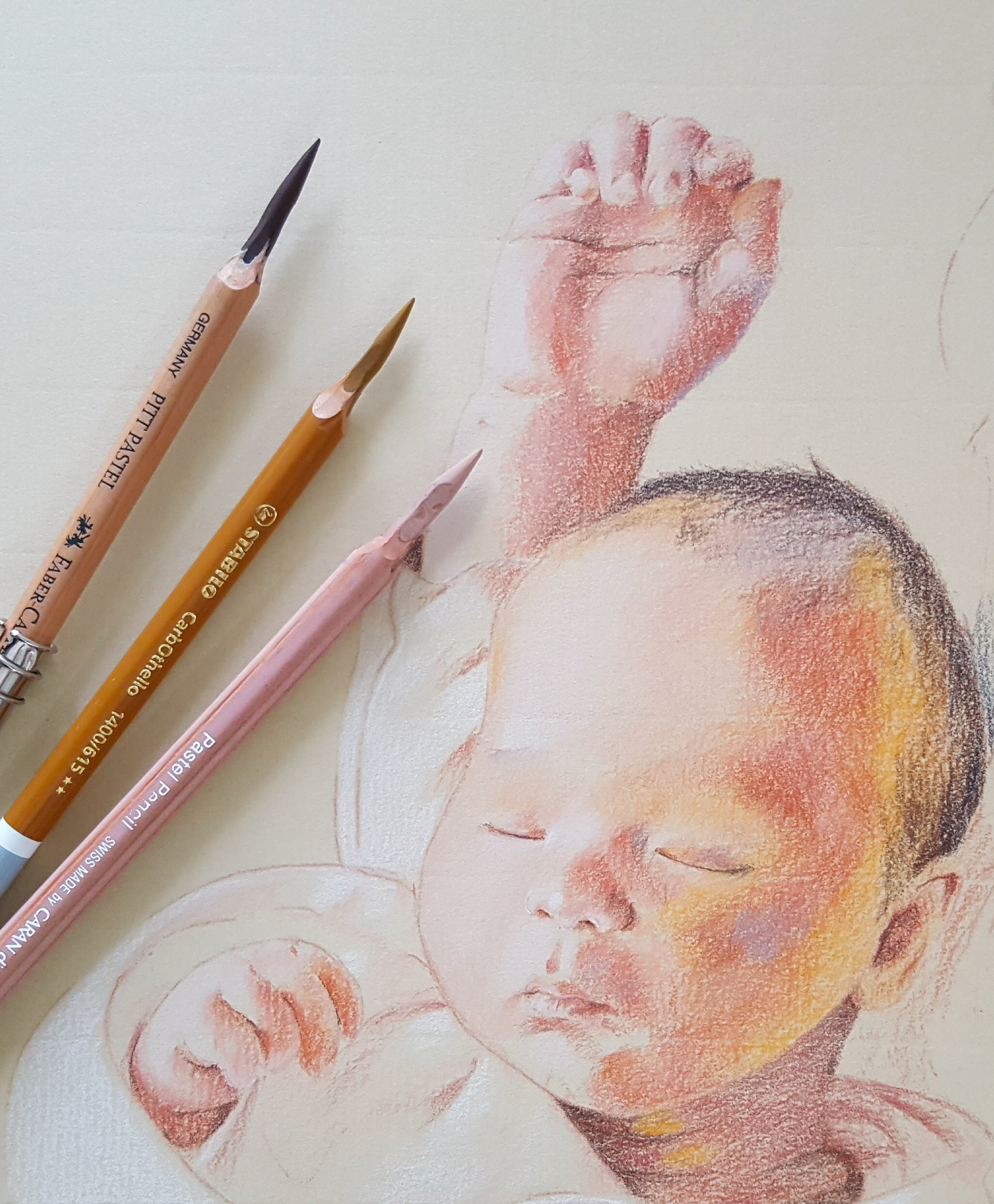
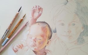
In addition to the sanguine portraits I have been drawing for the last few years, I can now offer colour portraits. I’ve had so much fun drawing these and look forward to many happy hours creating pink-nosed pugs, brown-eyed boys and grey grannies!
All prices have been updated, and if you’ve been hoping to commission a portrait but were deterred by costs then you may be pleasantly surprised.
Find out more
The Bare Essentials
If you’ve been following my posts you’ll know that we’ve spent the last few months – in fact a year and a half – debating a home extension versus moving house and many other options, to find the space we need. A fair chunk of this fantasy was to include a studio.
I won’t traumatise you with the ins and outs of why we eventually opted to move. But we’d made the decision and so our journey began….
My new studio
Keeping Down Waste
We have all watched in horror, the recent news reports of our oceans slowly filling with plastic bags floating like jelly fish, and seahorses trying to mate with cotton-buds. According to EcoWatch 50% of sea turtles have already consumed plastic and the amount of plastic in the oceans is set to increase ten fold in the next decade. Governments would have us believe the solution is complicated. So, it seems that as long as the laws allow industries to continue making plastics, the responsibility for reducing demand has to lie with individuals.
Read about my commitment
Discount Code
Many of my drawings are available to buy as prints, tote bags, cushions etc. Just for spring (until 21st June) and for newsletter readers only I am offering a special discount. The products are printed by Fine Art America and so the discount applies only to my commission and will vary with each item.
The code is STLLTN and should be applied at the checkout.
We have all watched in horror, the recent news reports of our oceans slowly filling with plastic bags floating like jelly fish, and seahorses trying to mate with cotton-buds. According to EcoWatch 50% of sea turtles have already consumed plastic and the amount of plastic in the oceans is set to increase ten fold in the next decade. Governments would have us believe the solution is complicated. So, it seems that as long as the laws allow industries to continue making plastics, the responsibility for reducing demand has to lie with individuals.
[custom_headline type=”left” level=”h2″ looks_like=”h5″ accent=”true”]Packaging of my Drawings[/custom_headline]
Recyclable
Reused
Degradable
No-Bend Envelope
✔
✔
Cardboard Insert
✔
✔
✔
Glassine Sheet
✔
✔
Cellophane Packet
✔
Recycled Cardboard Package
Plastics themselves fall into four categories: Non-recyclable, recyclable, recycled, degradable. Degradable plastics are far superior to those which may be or have been recycled. Recycling gives the product another use before it spends the next two hundred years in landfill. Degradable plastics will be reduced back into the ground within a matter of months or even weeks.
I avoid the use of plastics wherever I can, but where I do buy them, they will be degradable. Sometimes I may use bubblewrap. This will always be in the interest of re-using it as I receive a lot of this with the supplies I buy.
The packaging I use most often is cardboard. The beauty of card and paper is that whether or not you recycle it, it will soon enough break down and can be composted easily. Reusing cardboard is an ideal first step in turning the tide, and reduces production costs. I would encourage you to re-use my packaging wherever you can.
The quest for the best brand of pastel pencil for portrait drawing is a subject I have seen discussed all over the web, and, in my search for the ideal tool, is something I have researched extensively. However, my choice of pastel pencil will vary from other artists’ as I don’t limit myself to a single brand.
Buying (or receiving a gift of) a tin of pastel pencils, to get you started, is a common reason for singling out a particular brand. This may appear economical but it is worth considering starting with a selection of open-stock pencils and adding to your collection as needed. In buying a set, you will always be left with colours that sit unused for years. And conversely, however big a set you buy, you will always be left wanting.
Following the advice of other artists (Colin Bradley, Art Tutor and others) I bought a good selection of portrait-type colours in Faber-Castell Pitt Pastel Pencils. I find them firm enough to allow good control and with a decent amount of pigment. They are certainly a good choice and have a reasonable range of colours. But, they’re not my favourite.
Actually my least favourite. As well as the core often arriving shattered, these are hard and scratchy with an apparently high chalk content. I will avoid in future.
My regular online supplier, Jackson’s offer an excellent choice in open stock, so I have tried quite a few. However, my modest collection of Derwent pastel pencils originates mostly from tins I bought long before I had the world wide web of pastel choice available to me (yep, that was a very long time ago!). As you might expect, they haven’t aged well. They are dry and brittle, and it wouldn’t be fair to give the brand a bad review based on my decades old collection.
I have, however, bought a few Derwents from Jackson’s in recent weeks and I’ll let you know, just as soon as I’m able to form an opinion.
These pencils are a work of art. They are so beautiful I want to eat them! With their bleached wood finish and dipped end of colour, they do for me what sweets must do for most children. The pastel itself is just as delicious – no I haven’t tasted it, but I’m tempted!
They sweep onto the page like butter and are highly pigmented. But… a yummy tool experience does not necessarily equate to a good drawing implement and I’m afraid I generally find these too soft. Their high colour value and luscious choice of hue means I find myself choosing this brand just for the colour. The softness feels nice but isn’t practical as it leaves an uneven texture which is especially fiddly for smooth skin or hair. My solution is to lay the Caran d’Ache colour down, however unevenly, and almost burnish it to a smooth finish with a harder (Pitt) relevant shade.
My collection of Bruynzeels is very small and the only experience I can report is that they are brittle and I have found them almost impossible to sharpen. More research is needed though and I will be back with more information when I have it.
Often softer than Pitt, and brighter too, these are usually my favourite. Some of the colours, such as orange and caput mortem, I could not live without.
However, as I implied, quality of the core is inconsistent as the texture of Carbothello varies between colours. Caput mortem has a distinctive mid-tone hue and I always use it for drawing out the line but it is a bit harder and more scratchy than the equivalent Pitt colour, so for rendering a smooth texture I am more inclined to use the Pitt.
Coloured Pebbles in Pastel Pencil on Strathmore Charcoal Paper
I have given you so many options and no definitive answer. So which should you use? Which do I use?
All of them!
Each has its own benefits and pitfalls. I would always suggest trying as many different brands as you can. The way to do this without costing a small fortune is to write yourself a list of the types of colours you need, eg, dark red, ivory, pale pink, yellow ochre etc and then go through the open stock of each brand selecting only one or two from each colour-type, but spread your choice over 5 or 6 brands.
You will soon come to know the textures and ease of use for you and like me, you will probably find the right choice of pencil for you is all of them!