
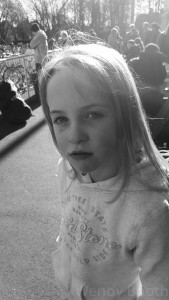
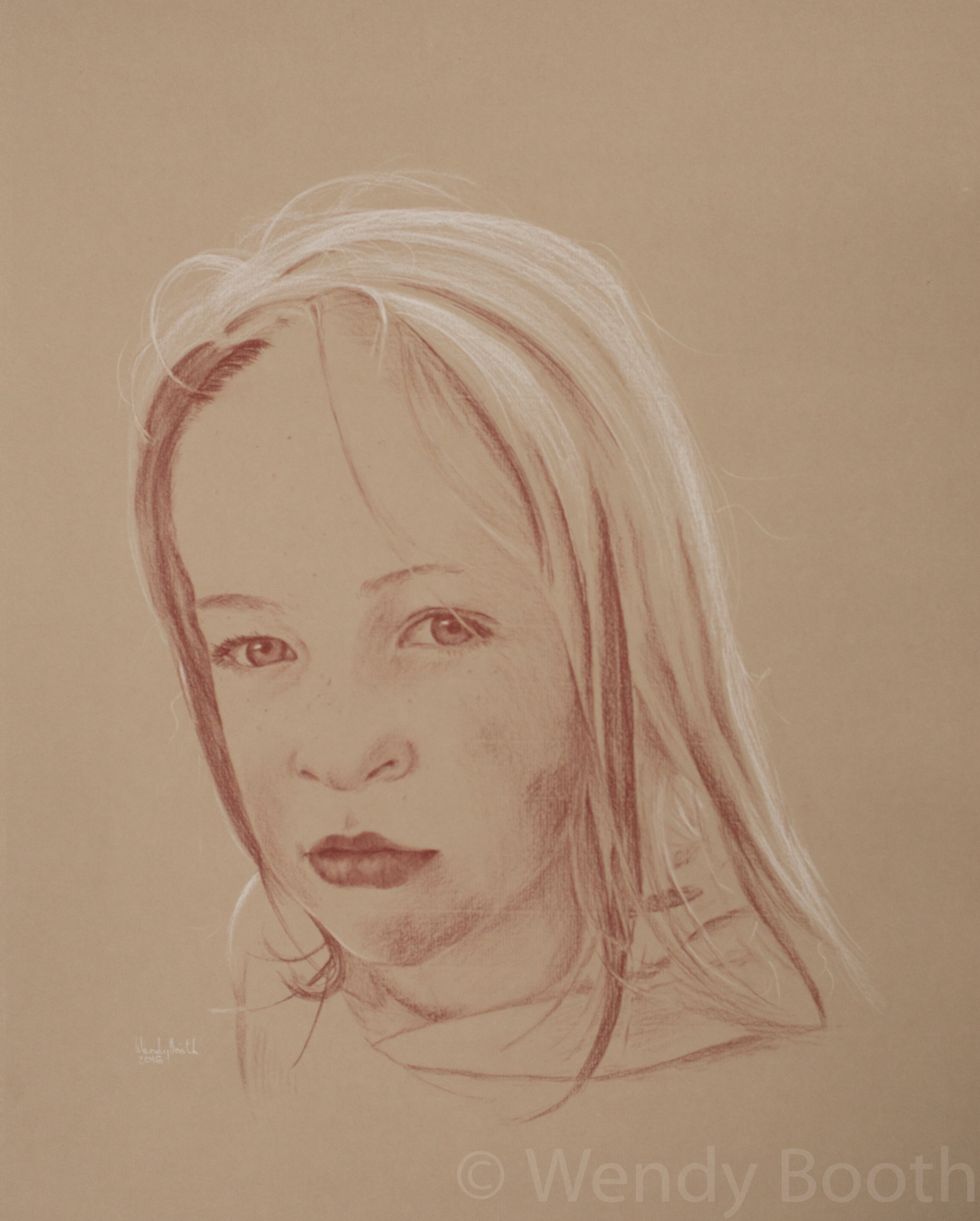
This gorgeous young girl is my niece. She has a beautiful ready smile which lights up her face the second she spots a camera. Any camera could capture this easily, but what I want is more subtle. Here, I managed to capture the quizzical look in the split second between her spotting me and realising there was a camera (actually Samsung 6 Edge) in her face.
- The light from behind gives her a ‘halo’ of sunlit hair, but the face itself is in shadow and there is very little contrast. This is where Lightroom comes into its own. I can easily adjust the levels, contrast and exposure so that any given part of the photograph gives me what I need. Here though, parts of the hair are overexposed and no amount of playing with levels is going to give me any detail. However, I haven’t lost vital facial features – this is a small amount of hair and I believe I can make a good guess at the texture.
-
-
Equipment
A2 Drawing board
Strathmore Velvet Grey charcoal paper (full sheet)
A3 Tracing paper
A3 cartridge paper or sketchbook
Low tack masking tape
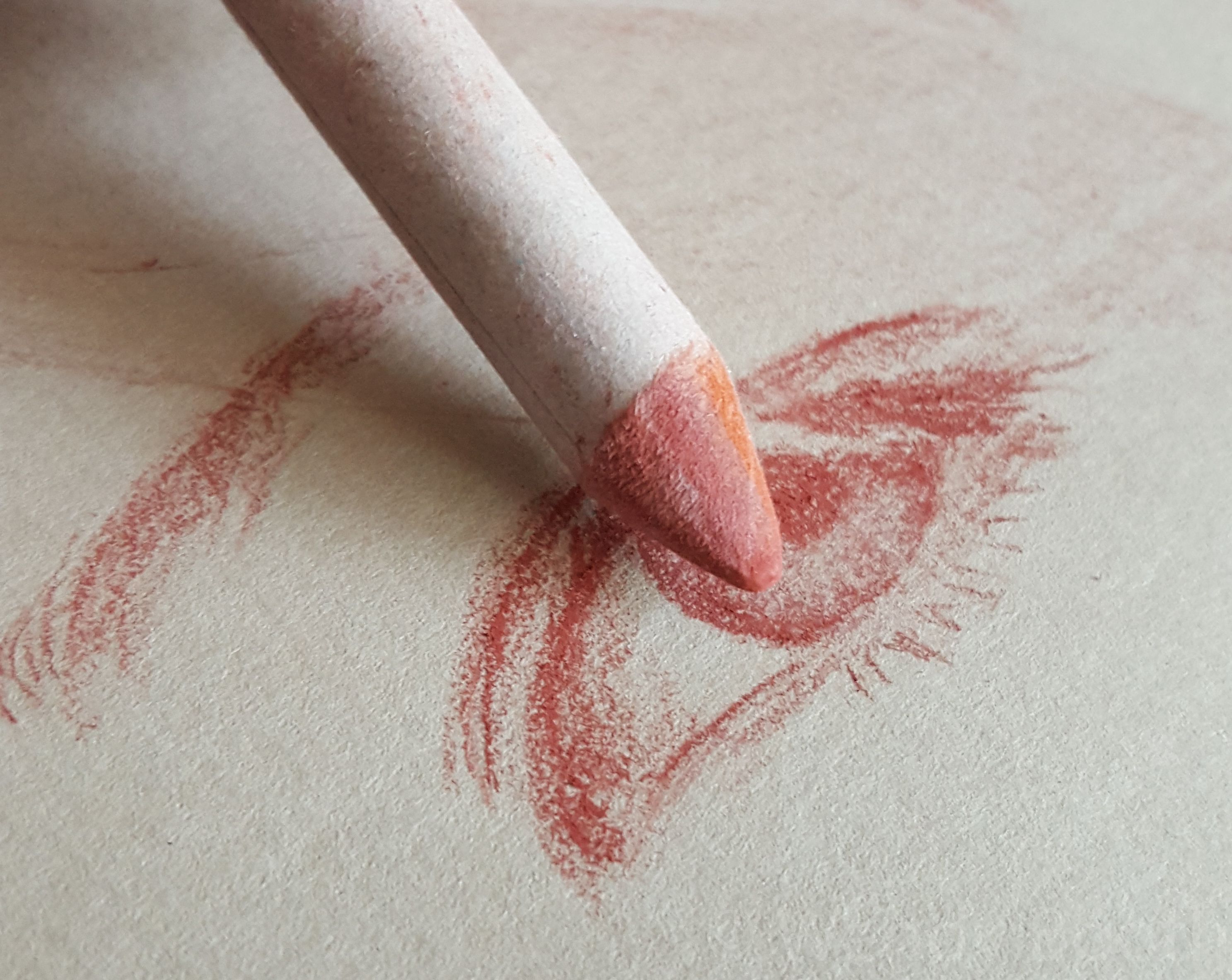
Carbothello Capuut Mortem Red pastel pencils
Carbothello Titanium White pastel pencil
Surgical knife
Sanding boards
Tissues
Torsion stump
2B Pencil or clutch pencil
Metal ruler
Table-top easel - I will cover notes about my equipment in another post – how to sharpen the pastels etc. But now let’s just jump straight in and start drawing.
My sketchbook is supported by the drawing board on a table-top easel in the most upright position. I find it essential to draw the foundations in this way. To draw with the paper flat on the table will give a distorted impression which will only become apparent when I look at the drawing head-on. However, during the whole process my board will be up on the easel and in every possible position flat on the table, turned around and back up again many many times.
I use an A2 drawing board with 3 or 4 pieces of cartridge paper permanently taped down with masking tape to give it a little bounce. The other side of my drawing board is a mess and used to support boards and canvases for oil painting – this is also where I cut the paper to size using the surgical knife and a metal ruler.
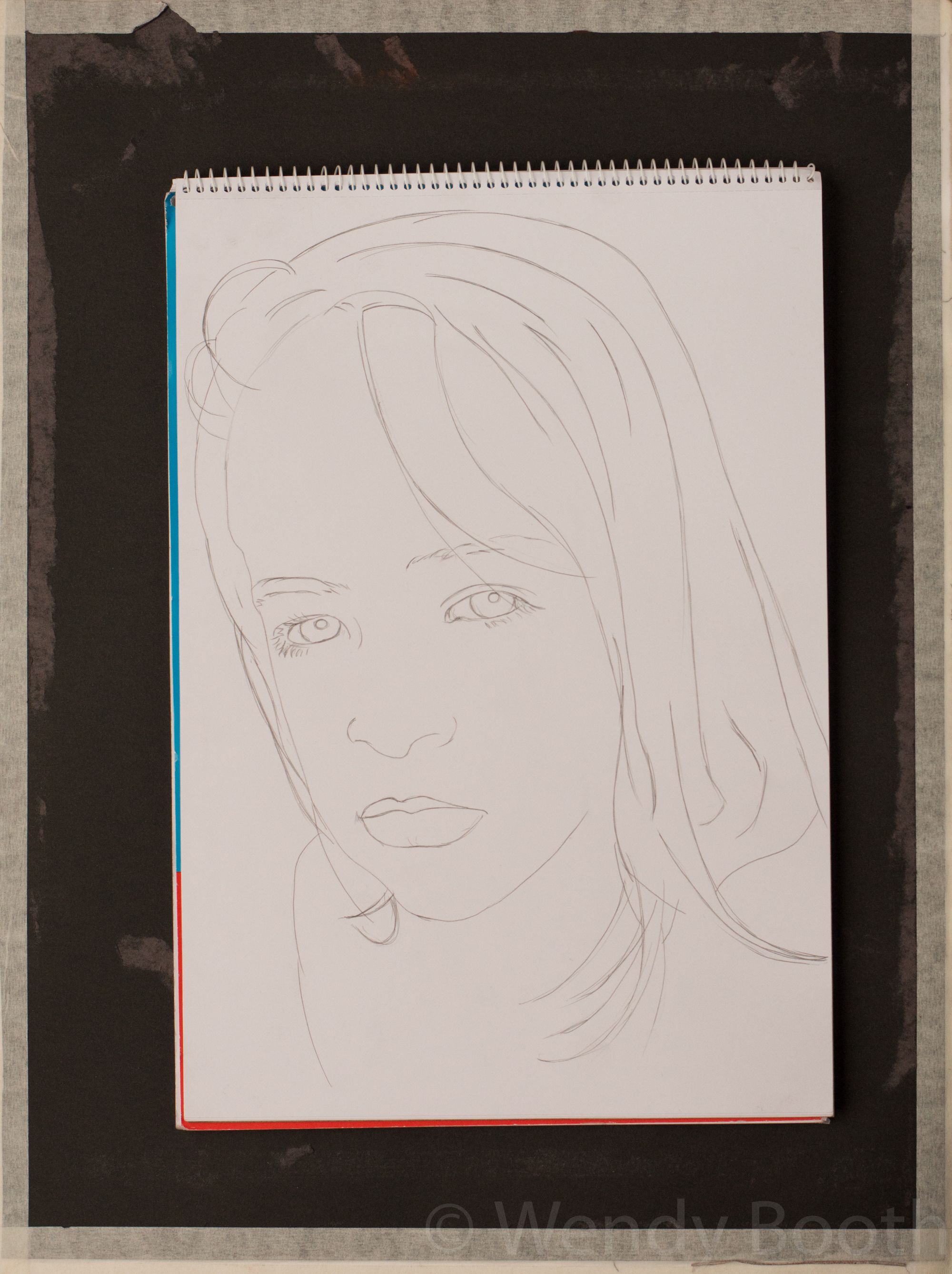
- 1) For the initial drawing on A3 paper, the whole head must fit the paper, but I don’t worry too much if there is a lot of hair, or clothing that doesn’t fit. Once it is transferred to the larger Strathmore paper there is room to expand.
I use a Faber Castell 2B clutch pencil – just because I love it! – but any soft pencil will do. At this stage I make a contour study (line drawing) with no reference to tone or value. It is possible to draw straight onto the charcoal paper, but I find that getting the features set first allows me much more freedom in the pastel pencil phase.
When creating a likeness there are no shortcuts.
-
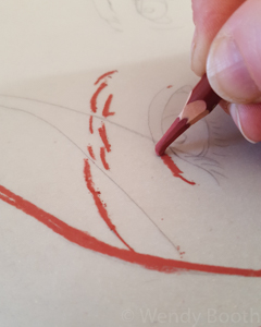
2) To transfer my line study to Strathmore paper, I use good old fashioned tracing paper. Each corner is torn off so I can use a square of masking tape on each to hold it firmly while I trace the lines with a hard pencil. I then turn over the tracing paper and (leaning on the back of a sketch book) trace the marks with my pastel pencil.
At this point I will consider the composition, which I’ve largely neglected before now. I always give plenty of room above and around the head. If the subject is looking away from the viewer then there needs to be space in that direction for them to look into. Also, there should be enough room beneath the face for some shoulder and clothes – this places the person and gives a little of their story.
When I’ve decided on the position I tape the tracing paper – with minimal masking tape – and trace very lightly over the lines with a ballpoint pen. Be careful the pen’s nib is clean and doesn’t drop too much ink because if this smudges onto the paper you’ll need to start again.


3) Once I think I’ve finished the trace I peel off two corners and carefully pull back the tracing paper to make sure I have everything down before removing it completely. There will often be a few places where the pastel has transferred inadvertently and I will dab these off with a putty rubber. Now I’m ready to start creating.
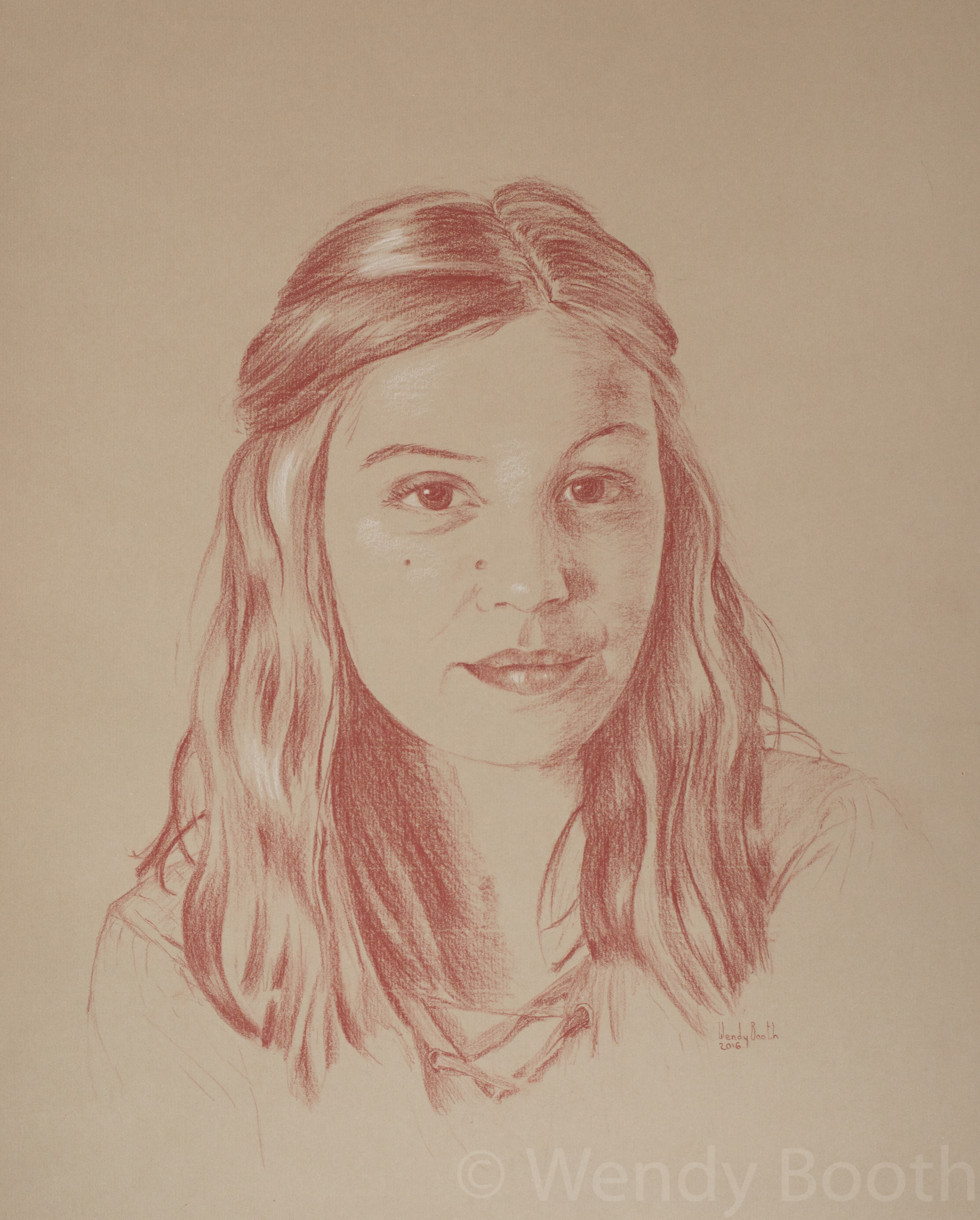
4) I will have thought about dark/light areas before but now it’s important to establish the three main values so I can determine where I will be using my two pastels. Ideally, around 70-80% of the flesh will be in ‘normal’ light, ie, not in shadow and not shining. If this is the case then I can use the red pastel (which I sometimes call Sanguine, but actually isn’t!) for the darks, and the white for the highlights. This is ideal but not always so. Sometimes I will have to use more white than ideal and/or more red. This isn’t a problem but takes more care because large areas of either can introduce too much texture if rushed.
- Starting in the top left corner (I’m right handed) which is usually the hair, I will begin to block gently using the side of the pastel. I love to describe the shape of the head using the shine of the hair. Examples of where I’ve employed this can be found in my portfolio eg, Honey, Max and Hu. Drawing each and every hair is never necessary, although a few hairs will help give texture and form. It isn’t necessary to use the same level of detail in the hair as the key facial features and I even blur the edges of the hair to give an out-of-focus look and so as not to detract attention.
-

The reason I begin up here is to avoid smudging my work. Another technique which really helps is to keep a sheet of A4 printer paper under my hand. In other media I wouldn’t necessarily work in this way – moving from one block of work to another. I’d be more inclined to begin with a sketch and gradually build up detail. However, I use this method for my pastel pencil portraits for two reasons. Firstly, to avoid smudging, but also because my board is so large that it’s quite cumbersome to keep shifting it around.
5) It is particularly important to keep the skin texture smooth when drawing children. I have experimented with many ways of creating smooth skin with pastel pencils and this has led to my current technique of very gentle handling of the pencil, building up shade gradually in varying directions. If it’s beginning to look rough then just dab away the pigment with a putty rubber and try again. Strathmore Paper is quite robust in my experience.
- 6) The eyes are my absolute favourite part of a portrait and once you have them looking like their owner then you know you have it! However, it can be quite disturbing to have your mother’s (for example) eyes staring back at you from within your work. Always start gently and build up value from the outside first. I am aware of how long this blog is becoming, so I will save a description of drawing eyes for another time. They deserve a whole article just to themselves.
7) The nose is easy to neglect, especially as it follows the eyes and that epiphany moment where I know it’s all coming together. Noses aren’t to be downplayed though and it may even be worth taking a break after the eyes so you’re coming at it afresh. Talking of breaks – they are essential. Not only for your sanity but it allows you to view your work with fresh eyes. Errors will pop out and can be corrected in the early stages.
Next, the mouth. Again, accurate observation is essential. Keep your strokes light until you are sure everything is in place.
8) Clothes can be quite fun and they can play as large or small part in your picture as you like. They will often tell you a lot about the character of the subject. I like to capture little things like folds and buttons in just a couple of strokes – these are my reward for anyone that takes time to look beyond the facial features.
- 9) Finally, if my picture isn’t already on an easel at this stage, I will prop it up and step back. I make a mental note of everything that still needs work. Here, the hair above the right hand shoulder needs work, shading needs darkening in places and the clothes need a quick tightening up. And then (OK so that wasn’t quite ‘finally’) I leave it overnight. It sits on the easel staring at me for the rest of the evening – if there’s any evening left – and I come back to it in the morning. Some things leap out, even at this stage, usually around the eyes.

And, if you’re still with me, take a photo. Looking at the drawing on screen with either show up any final flaws, or will confirm that you are a great artist!
One Comment on “Demo: Girl from Backlit Photograph”
Looks good! Love you